
Thursday, October 8, 2015
Sunday, December 7, 2014
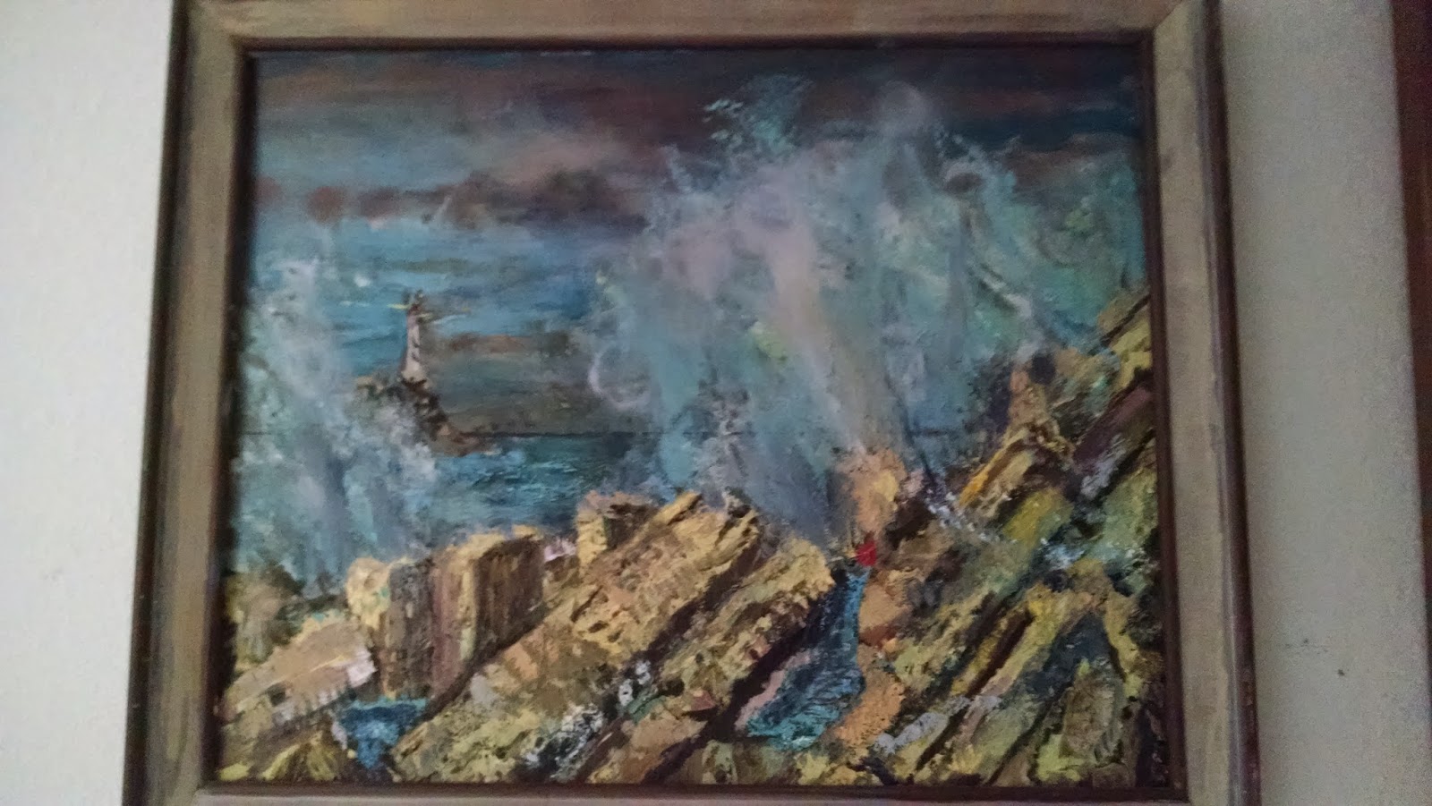
Paintings Hanging in my Parent's House in Pearland, TX


Friday, November 7, 2014
Lighthouse

Wednesday, October 23, 2013
Neo-colorisms -- Transhumanism Archives
Try Not to worry about Colors in your Painting
mashed articles by Pat Darnell | Oct 23, 2013 | Bryan TX

Transhumanism Archives - : "Of the vast wavelengths that span the electromagnetic spectrum, humans can see a mere 2.3%. Rainbows? They’re just a fraction of the real picture. We’ve crafted abstract theories to understand x-rays, radio, microwaves, and gamma rays. But how much more advanced would humanity be if we could perceive the other 97.7% of reality?"
'via Blog this'
For years I have told to whoever would listen, "Don't worry about colors when you paint!" I admit it is one very sarcastic comment. But truth is that color is not what it might have been in the days when oil painting was begun. Mixing pigments with a suitable medium to get a proper blue, or a proper yellow was time consuming and expensive. A painter might have to hire an assistant to just grind pigments all day for him.
Today oil colors come in every tint and hue, and premixed, and in handy tubes. You want a specific chartreuse -- hey, go to Dick Blick web site and there it is. Buy it and ten more colors for a low price? So you see color is not the issue the founding painters had. We are given a gift of color. And we can reinvent color, as the article above describes.
The reason I say don't worry about color, is because some painters psych themselves out about which color, and fail to start their painting. You all know that once you start, you will work like a slave to finish, right?
_______________________Reference
http://disinfo.com/2013/10/experiment-allow-us-see-new-colors/
mashed articles by Pat Darnell | Oct 23, 2013 | Bryan TX
Transhumanism Archives - : "Of the vast wavelengths that span the electromagnetic spectrum, humans can see a mere 2.3%. Rainbows? They’re just a fraction of the real picture. We’ve crafted abstract theories to understand x-rays, radio, microwaves, and gamma rays. But how much more advanced would humanity be if we could perceive the other 97.7% of reality?"
'via Blog this'
For years I have told to whoever would listen, "Don't worry about colors when you paint!" I admit it is one very sarcastic comment. But truth is that color is not what it might have been in the days when oil painting was begun. Mixing pigments with a suitable medium to get a proper blue, or a proper yellow was time consuming and expensive. A painter might have to hire an assistant to just grind pigments all day for him.
Today oil colors come in every tint and hue, and premixed, and in handy tubes. You want a specific chartreuse -- hey, go to Dick Blick web site and there it is. Buy it and ten more colors for a low price? So you see color is not the issue the founding painters had. We are given a gift of color. And we can reinvent color, as the article above describes.
The reason I say don't worry about color, is because some painters psych themselves out about which color, and fail to start their painting. You all know that once you start, you will work like a slave to finish, right?
_______________________Reference
http://disinfo.com/2013/10/experiment-allow-us-see-new-colors/
Saturday, June 16, 2012
Purple Glaze: A Brief Discussion of Painting on Canvas
 If you are a good draftsman, then always work toward your strengths. Lay it out, and work with perspective and proportion. Here is a Lighthouse scene. I usually put reference page and photo credit on any 8 x 10 studies. "Eagle Bluff Light, Ephraim, Wisconsin: marks the entrance into East Channel into Green Bay. It was built on Lake Michigan in 1868, standing 75 feet above the lake, with originally a third-order Fresnel lens. It is a brick tower still aiding in navigation today" (Crompton, S W. UB of L, 2005).
It doesn't hurt to under paint a scene with complementary color scheme. Using acrylics for this; remember if
 you are oil painting, you have to put water based colors under the final oil base paints; lean under fat as the saying goes, or fat over lean. This roof for instance is going to be Terra cotta, so I under painted with blue slate color.
The bush is in shadow, so I started with dark coloring moving toward lighter later. This is the best way to to produce details in shadows.
And the foreground wall will be yellow limestone, so I under painted with blue shades, Payne's gray, with more dark blue in the clouds. Again it all moves from dark to light, background to foreground. The
 subject lighthouse
will hopefully end up detailed and sculptural, framed in rich, subdued colors.
Add color. In this case I am doing a study of the various aspects of lighthouses, and not too concerned with palette. However, as I become familiar with lighthouses as a subject then I would choose a group of harmonic colors right now, and stick with them. Here I am using primary colors, mixing pastels from those, as I add features. It turns out the painting starts to fall apart, as complementary colors are set in juxtaposition. Soon the adding of shadow starts to mess up the perspective, and details begin
to get lost, straight lines become
bowed lines... either optical illusions, or just lazy brushing.
Here is an inverted color negative showing true color complements. This could help in coloring the problem areas of the piece.
Add color. In this case I am doing a study of the various aspects of lighthouses, and not too concerned with palette. However, as I become familiar with lighthouses as a subject then I would choose a group of harmonic colors right now, and stick with them. Here I am using primary colors, mixing pastels from those, as I add features. It turns out the painting starts to fall apart, as complementary colors are set in juxtaposition. Soon the adding of shadow starts to mess up the
 perspective, and details begin
to get lost, straight lines become
bowed lines... either optical illusions, or just lazy brushing.
Here is an inverted color negative showing true color complements. This could help in coloring the problem areas of the piece.
How to keep the painting together is to make decisions as the rendering continues. Decisions are based on observable data. For instance, lighthouses are generally not a  romantic get-away. Rather, they are
  situated on crags and wind-swept reefs that were once noted as demons
on nautical maps. So, I am experimenting with colors to try to capture forebodings; a bleak place where existence is difficult; structures that must stand up to sheer brutal punishment by natural weathering winds. Thus, buttressing walls, stone and brick construction, copper storm shutters and scuppers, and heavy roofing.
The most difficult part of doing a study is in trying to balance the mess. Some of the intermediate stages have features that look really good. But as another area of the canvas is worked it somehow cancels the parts that I just finished. Highlights fade, and shadows take over, or become ambiguous...
I see as I go that the underpainted version looks real good. I like the bold red lighthouse tower, and the blue mortar in the house. But alas the total structure is made from local yellow sandstone. So for believable finish everything stone becomes yellow's cousin.
I think before I call this quits and spray it with varnish, I might try to do some "glazes" in red-blue, purple, hues to make some shadow on the house and tone down the yellow. Most of the structure is trimmed in copper, so tarnished copper and green are good for other color trials. If this were a 144 inches by 96 inches, first trial, I would at this point be pulling my eyebrows out. No lie!
Fortunately, it is only 8 x 10 inches and manageable for trial and error. Also, I want to point out after all the groundwork has been laid out as it has been now, I as artist can anticipate some fun with the project in final stages. More on that aspect later...
 romantic get-away. Rather, they are
  situated on crags and wind-swept reefs that were once noted as demons
on nautical maps. So, I am experimenting with colors to try to capture forebodings; a bleak place where existence is difficult; structures that must stand up to sheer brutal punishment by natural weathering winds. Thus, buttressing walls, stone and brick construction, copper storm shutters and scuppers, and heavy roofing.
The most difficult part of doing a study is in trying to balance the mess. Some of the intermediate stages have features that look really good. But as another area of the canvas is worked
 it somehow cancels the parts that I just finished. Highlights fade, and shadows take over, or become ambiguous...
I see as I go that the underpainted version looks real good. I like the bold red lighthouse tower, and the blue mortar in the house. But alas the total structure is made from local yellow sandstone. So for believable finish everything stone becomes yellow's cousin.
I think before I call this quits and spray it with varnish, I might try to do some "glazes" in red-blue, purple, hues to make some shadow on the house and tone down the yellow. Most of the structure is trimmed in copper, so tarnished copper and green are good for other color trials. If this were a 144 inches by 96 inches, first trial, I would at this point be pulling my eyebrows out. No lie!
Fortunately, it is only 8 x 10 inches and manageable for trial and error. Also, I want to point out after all the groundwork has been laid out as it has been now, I as artist can anticipate some fun with the project in final stages. More on that aspect later...
A study like this is without parallel for learning a subject. If I decide to do another, and larger painting of this, it will take less time, and less mess to accomplish. Most of the time I skip this study stage, leaping rather right in with large brushes, and lots of oil. I end up making brown of my colors, and grey skies... so you decide how to go about your own dabbling in rendering.
Thursday, October 27, 2011

Tuesday, October 25, 2011

Saturday, October 22, 2011

Friday, October 21, 2011

Sunday, September 18, 2011
Dez Doodles

Scanner couldn't handle the whole piece, so it is in two parts here.


Friday, March 4, 2011

Mottled Shade of the Back Forty
30" x 36" Opaques and Hues Abstraction, Chortling Rooster

Back Forty is a series of paintings

Back Forty is a series of paintings
Thursday, March 3, 2011


Wednesday, March 2, 2011


Back Forty Series, Serenity

Scene is from Sturbridge Village, Mass., photo from around 1986, but I painted it in 2004.
I wonder if this is still there, since I haven't been back in twenty years.. funny how quick life goes by.
Cleaning my Brushes: Padreno after the Gale
by Pat Darnell
 Introduction to My New Idea for
Couch d' Art
This little oil painting keeps popping up in my blogs. And here it is again; that is because I think everyone desires a wall hanging. Let me explain.
It was done hastily on a canvas board after I finished another larger painting -- it was a stab at finding a use for left over paint on my palette. Many times my smeared up palettes look much more interesting than the finished painting.
It turns out framed artwork is illustratively final, and can be off color once you get it home and try it on your walls. Also, oil on canvas board is a no-no because slow evaporating oil needs both sides of the surface to be open to air. The smeared look of the finished painting is always disappointing with oil on canvas board. The best ground is primed linen. But more on that later.
This is so true especially if the artist is red\blue deficient. Many of us males are , by the way r\b or red\green "deficient;" [don't believe me; go get your eyes tested for it]. Many Impressionists had cataracts and other vision problems.
My glasses were so imposing most coworkers called me Poindexter... or Four-eyes. I went through the contact lenses stages, to get away from the bookworm image... only to become intolerant in an allergenic way. It was during the years when smoking was not banned in the workplace.. so probably second-hand smoke was rasping my lens covered eyes as a non-smoker.
Yes, people used to sit at their drafting tables smoking and drawing eight hours a day, indoors. Ouch -- that brings back raw memories, of sweat box drafting rooms and printing shops...
Today we have Lazik technology that will cure any person with acute sight problems. And I am also a Lazik patient. My parents, both in their eighties, have had double cataract lens replacement surgeries.
Guaranteed I have had plenty of experience with vision, persistence of vision, color theory first hand, and am very sympathetic with anyone who has vision development problems.
Now that all said, here is a plan. I will put color families up on this site with some degree of accuracy. If you want a painting done, you tell me which family of colors your abode is ranged, and WAA-LAA!
Look for it in MooPig Paint future sidebars, as I scan\cut\paste and make it happen... it is really based on two larger families of Pastel and Primary... you will get it, and maybe become more secure in picking wall hangings for you lovely homes.
- Pat Darnell and Friends
Chicago Forest Preserve, off River Road
by Pat Darnell
Remember just a few months ago? Well it will be back soon.
I lived in Chicago area for many years, long enough to get a real feel for beauty, and ugliness, of snow fall and Spring melt season.
Sometimes on the actual day of Easter, it would snow all night with big flaky flakes, and create the most beautiful scenery.
Des Plaines River, Oil on antique linen, damaged antique frame from a garage sale,
Today is my brother Dave's Birthday. Happy Birthday Dave.
Tuesday, March 1, 2011


ppp.jpg)
Monday, February 28, 2011


Sunday, February 27, 2011
Cleaning my Brushes: Old Water Tower


Friday, February 25, 2011

Bahama Conch Shells

"Hey Garnet Gurl, is this Cobalt enough? or do you like it more Balt than Co?"
Oil on Canvas Cotton, 36" X 36"
Dad paused to listen to the ocean, in a conch shell.
Thursday, February 24, 2011


Subscribe to:
Posts (Atom)